Project search - charts
As a new option to provide a different visualisation of how your projects look, we've recently added the ability to display your search results as a chart. Let's take a look and see how it works!
Searching #
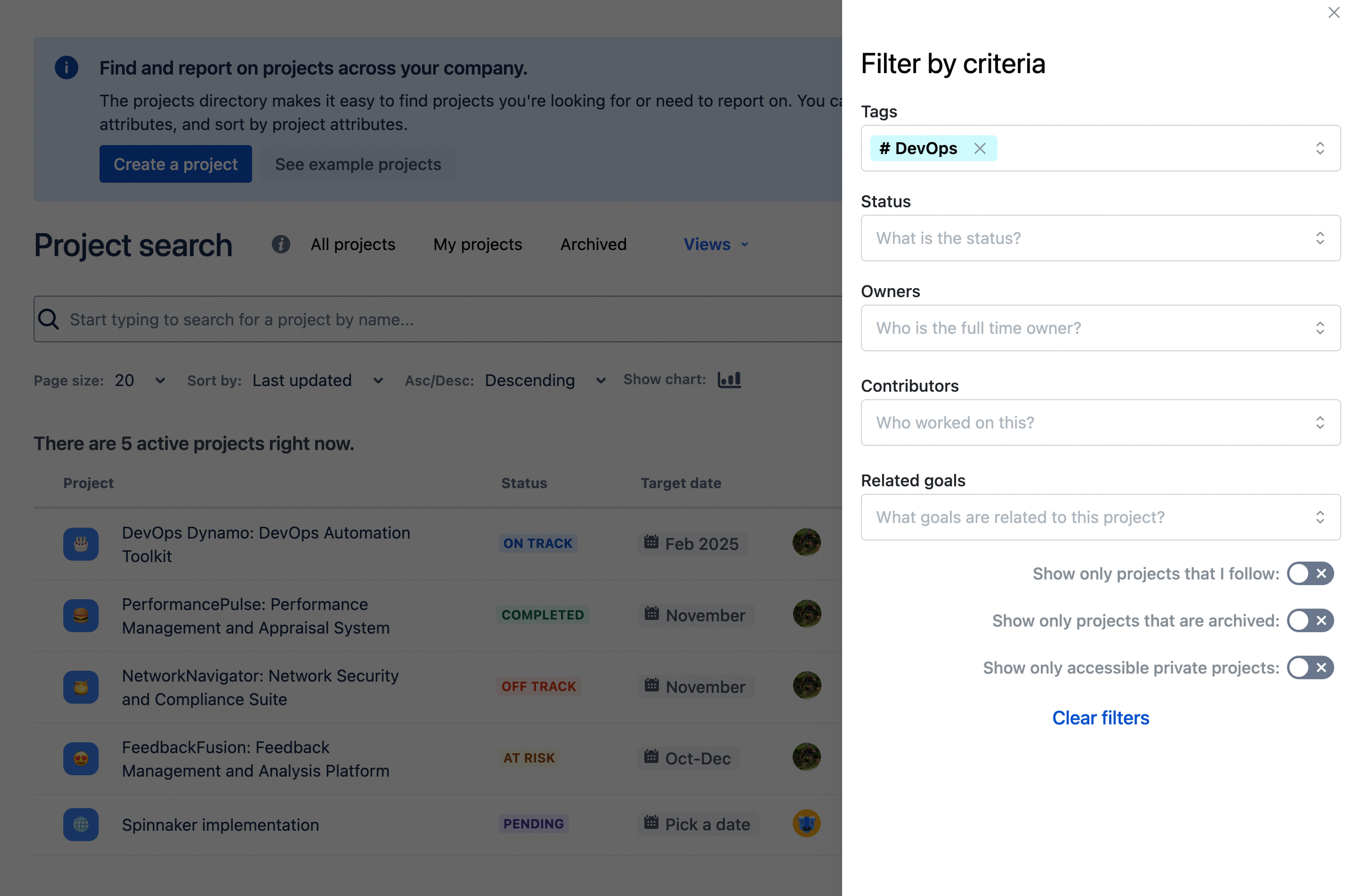
Searching works as it usually does, adjust your criteria and find what you are looking for, in this case, we're finding all projects tagged with 'DevOps'.

Display as chart #
Now that we've found what we're looking for, we can use the 'display as chart' button to view it.

Chart display
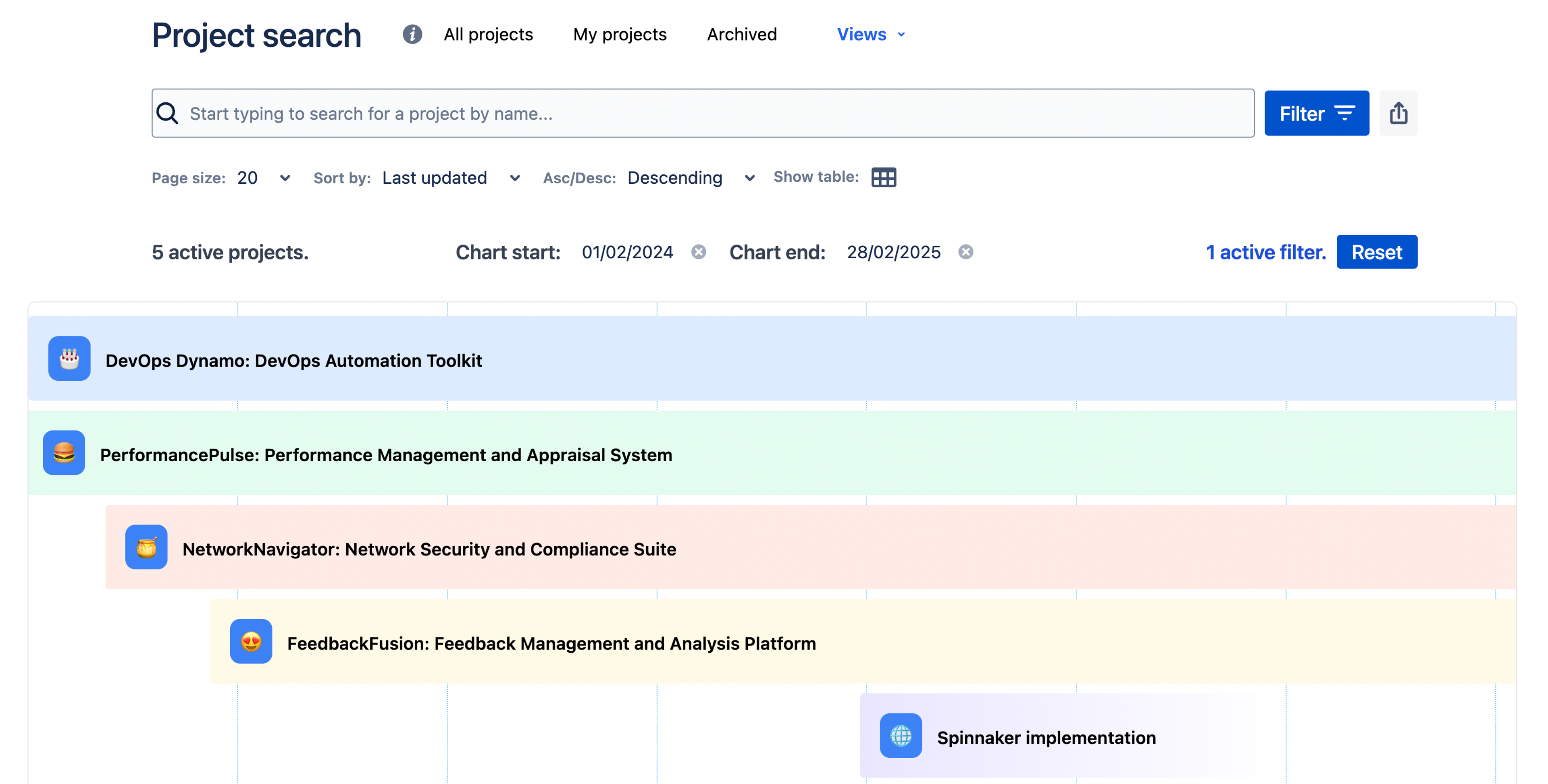
And now we have our chart!

There's a couple of things to note with this:
- Bars are colour coded by status
- We'll drop a light blue line to indicate 'today'. If this is not in range, we'll shunt it to the very start of the view or off screen.
- Projects that don't have a target date set will taper out their bar to indicate that they're a little undefined. This will be projects that are 'pending'.
- For super short projects, as in less than a 2 weeks, we'll extend the bar a little to actually show the details. Hovering over the bar will give the real tooltip info
Adjusting the view #
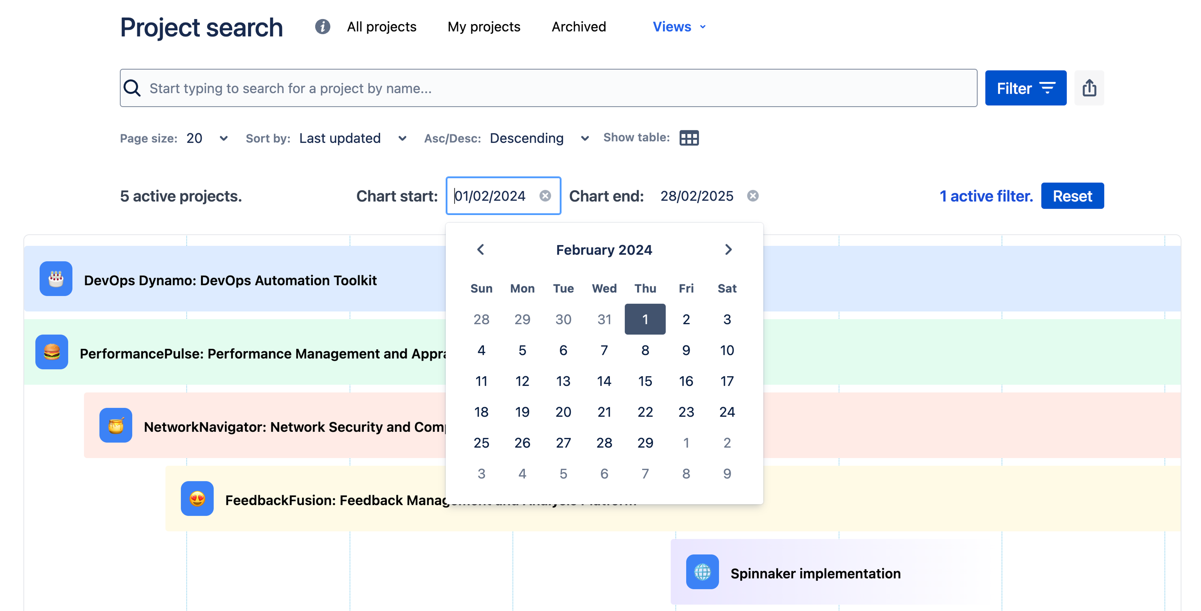
You can also adjust the view using the chart start date and chart end date options to narrow or expand the number of months on the view.

