
Beacon - Status Tracking, Simplified.
Hill charts
Progress you can see and feel. #
Hill charts are designed to give you a visual, intuitive sense of where projects and goals really stand in relation to the work needed to complete the project or goal.
Hill Charts give you a bird's-eye view of work so you can see what's moving forward and what's been completed. If you haven't used Hill Charts yet, they track progress on dependent and related work in a project or goal.
Tell me more... #
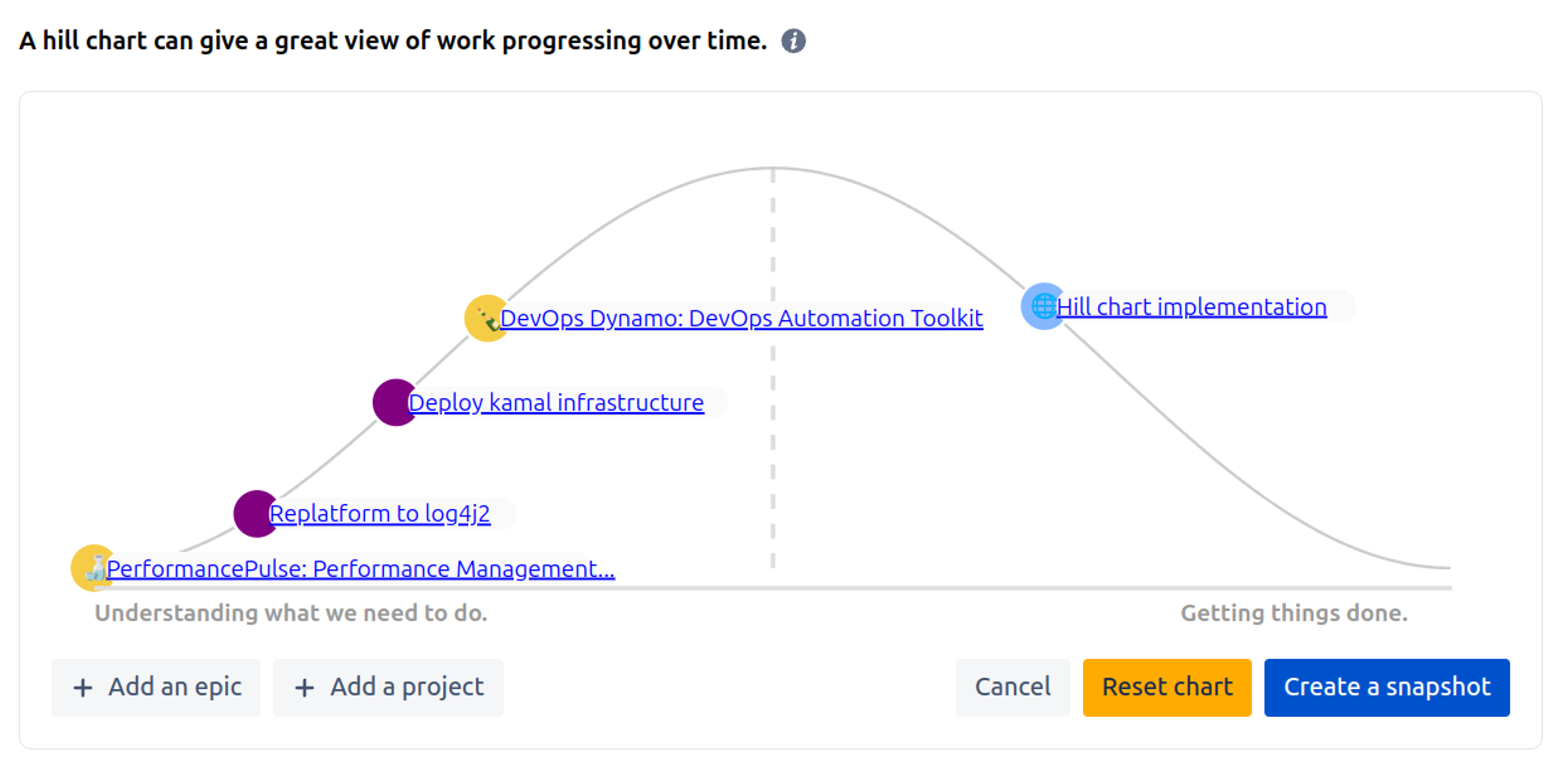
Work typically has two parts.
First there’s an uphill part where you figure out your approach and what to do. You have a basic idea about the task, but you haven’t figured out what the solution is going to look like or how to solve all the unknowns.
Eventually you reach a point where there aren’t any more unsolved problems or you have a good idea of how to tackle them.
That’s like reaching the top of the hill. You can see clearly all the way down the other side.
Then the downhill phase is just about execution, getting things done and communicating progress.
We move the elements around on the chart to indicate what state the work is in.
Some things to know about the charts #
- Elements on the chart are of a standard size.
- Elements on the chart are colour coded to their current status, so if a project or goal is off track it'll look a little red. Epics are a little different, we map those to be a delightful purple colour - it's nice to coordinate with Jira.
Projects #
For projects, each element on the Hill chart represents a related project or a Jira Epic that is associated with the project.
Goals #
For goals, each supporting project and sub goal is represented on the chart.
How to use them #
As the project or goal progresses you can move elements uphill as you figure things out and really get into the detail of what needs to be done. The elements can trend downhill when the big questions are answered and the remaining work is straightforward and we know what to do.
The Hill Chart shows a project's current state well, but it's hard to quickly tell if everything is going well or if some aspect of the work in the project is a bit jammed up.
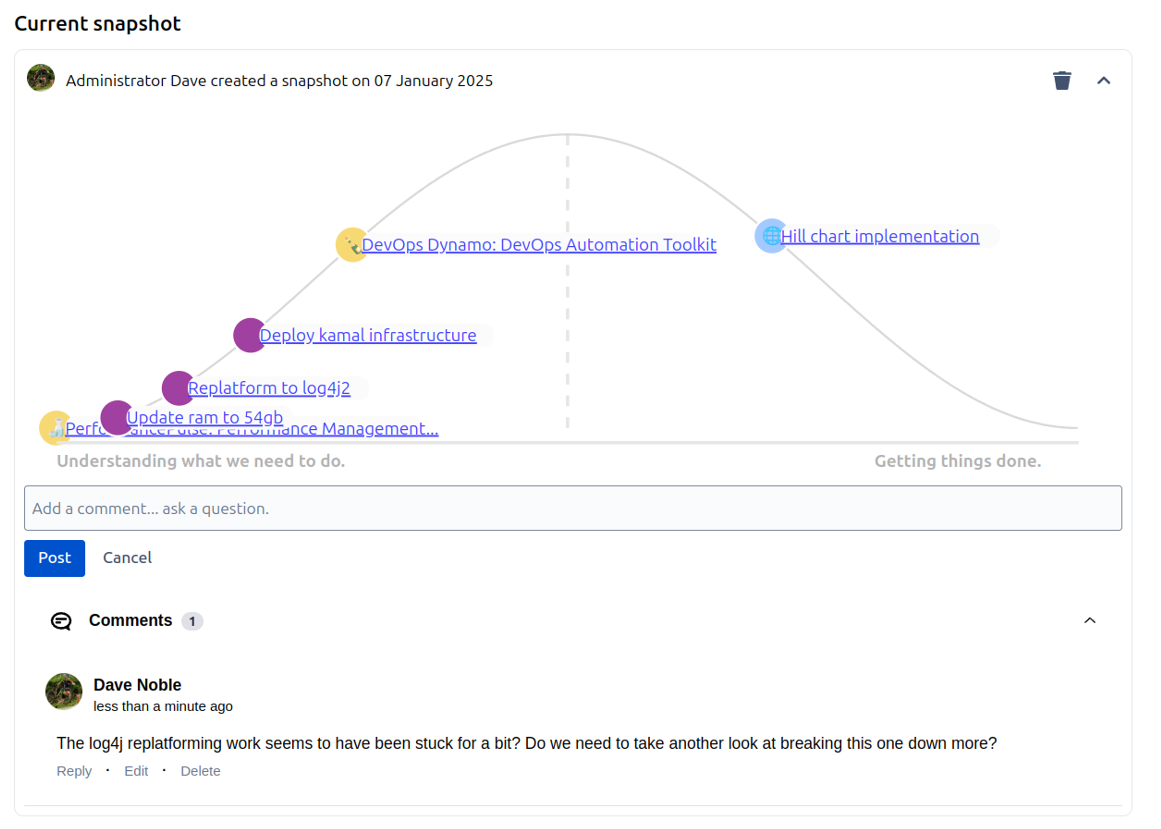
Because of this, we keep snapshots of the previous updates in a read only mode, so you can open them up and compare to the latest chart to get an indication of how things are progressing.
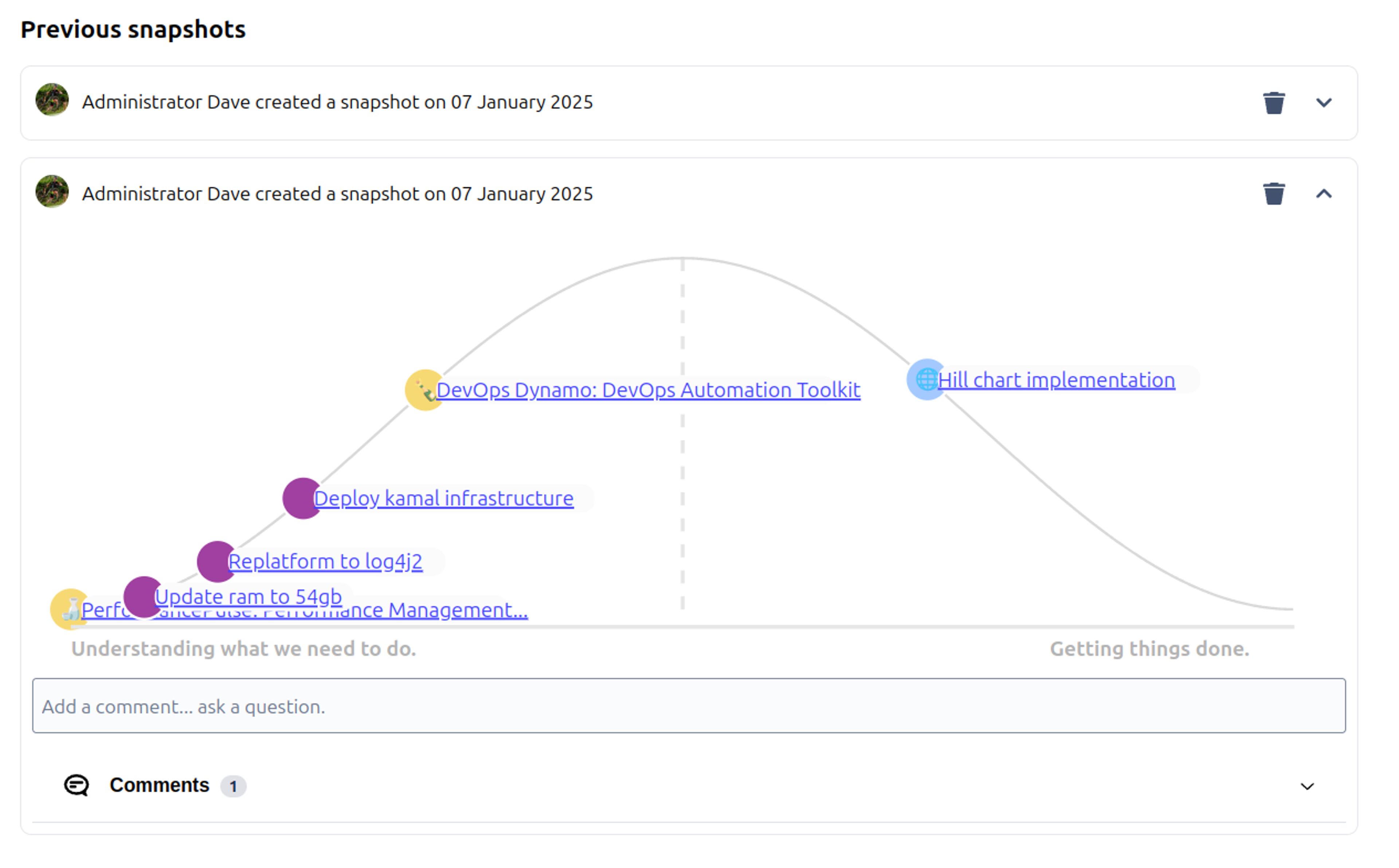
As the elements move around on the chart, you get a sense for what's moving and what's not. If something hasn't moved for awhile, it might be worth digging into.
You can also see who made each update and when it happened. This gives stakeholders a lot of context about what’s moving and what isn’t without harassing the team with questions.
Updates can be annotated with commentary, and you can even comment on someone else’s Hill Chart update. This enables a new level of fast, asynchronous communication about high-level progress on work.
Defining work better #
Sometimes trying to position an element on the Hill Chart can help you to better structure the work.
Here's an example in relation to sending notifications inside of Beacon - lightweight project and goal status tracking for Jira - we were building a feature to notify stakeholders of when project updates were due.
That element sat there for a few days without shifting. We clearing weren't making progress and getting things done.
After looking into things more, it turned out that we didn't know where to move the element to because there were multiple parts of this work. Some of it was well known like integrating into Jira's email API, but other parts weren't like connecting it up the internal scheduler and we also didn't know what to use to template the emails as well.
In a case like this, the hill was telling us that we'd wrapped up too many things in the same element. So we split things out into multiple Epics to track all three things on the chart correctly.
Now we're in a position where we can accurately see more of the breakdown of work and things started to move a little better once again. Nice!